The average website has over 55% of its traffic coming from mobile phones. Almost 60% if you include tablets like iPads. While industrial sites are a little less, consumer-related websites can be significantly higher. Making sure your website is built to accommodate mobile users must be a top priority.
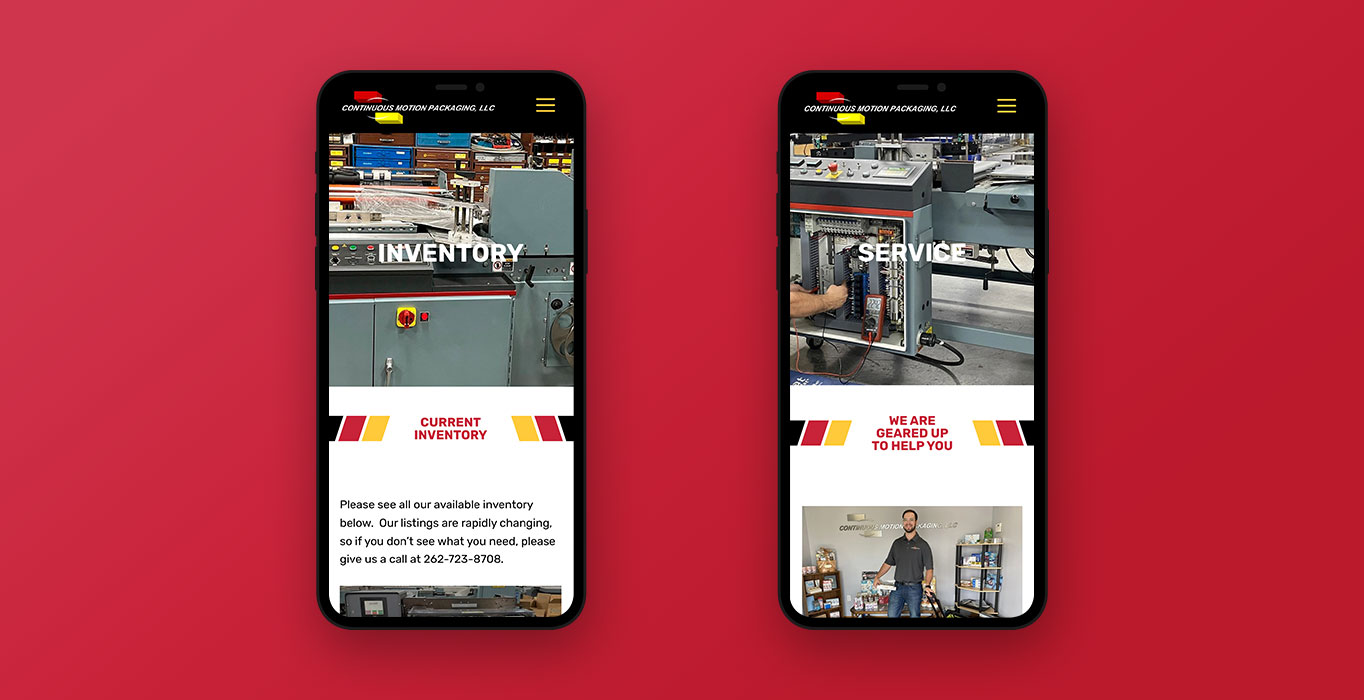
Understanding Mobile Responsive Website Design
Mobile responsive website design refers to the process of creating websites that are easy to read and navigate on any device, regardless of its screen size. A mobile responsive website will automatically adjust its layout and content based on the device it is being viewed on. This means that whether someone is accessing your site from a desktop, laptop, tablet or smartphone, they will have a seamless browsing experience without having to zoom in or scroll horizontally.
With the increasing use of mobile devices for internet browsing, having a mobile responsive website has become more critical than ever. Here are some reasons why:
Why is Responsive Design Important?
- Better User Experience: A mobile responsive design ensures that your website visitors can easily read and navigate your site, leading to a better user experience. This positive experience can result in increased time spent on the site and lower bounce rates.
- Improved SEO: Mobile responsive websites are favored by search engines like Google. With a single URL for all devices, it is easier for search engines to crawl and index your website, resulting in higher rankings.
- Increased Reach: Starting several years ago, Google began prioritizing mobile responsive websites. Because of the rapid growth of mobile searches, Google lists mobile responsive websites ahead of non-responsive sites.
- Cost-effective: Back in the day, mobile versions of a website needed to be built separately. You can imagine how that skyrocketed the cost. By designing a single website that adapts to all screen sizes, you save time and resources.

Tips for Creating a Mobile Responsive Website
Now that we understand the importance of mobile responsive website design let’s look at some tips to help you create one:
- Pre-Design Wireframes: Whether you use a prototyping design tool like Adobe XD or old fashioned pen and paper, planning saves valuable development time. Determine how the responsive elements will handle long text, images, and forms.
- Use a Responsive Framework: A responsive framework is a pre-built code library that makes it easier to design responsive websites. It provides a set of tools and templates that can be customized according to your needs.
- Design Hierarchy: What are the most important elements on the page? How can you logically organize your website so the most important elements to the user are given a visual priority. From call to action buttons to critical service descriptions, make sure you lead with your critical information.
- Optimize Images: Large images can slow down the loading time of a mobile site. Make sure to optimize your images for smaller screens to reduce loading time and improve user experience.
- Test, Test, Test: Before launching your website, it is crucial to test it on various devices and operating systems (i.e.Mac vs PC, Firefox vs Chrome). This will help you identify any issues or glitches that need to be fixed before making it live.
Keep Mobile at the Front of Your Web Design Process
Whether it’s most of your traffic or just a fraction, mobile users are the driving influence in web design. Mobile responsive website design is the fastest and most effective way for developing a website that serves everyone’s needs.
If you’d like help developing the right mobile responsive website for your business, reach out to Signalfire.
Our team will work with you to create a website that will serve your needs into the future.